TYPE
Lupton. E, Miller. A (1996) Laws of the Letter. Design Writing Research. Writing on Graphic Design. Honk Kong: Phaidon Press Limited, pp 53-61.
What followed is described as STRUCTURALIST TYPOGRAPHY that emphasises a series of characters - 'a systematic relation'- rather than its individual parts. In other words, the relational system of the font generate meaning. (Lupton, E. 1996)
I'm looking at these examples because of their simplistic nature and elegance. Some other modern type designs will be also used for inspiration and manipulation into a hand-drawn type I'm going to create as an experiment. Rather than a computer-generated font, it will be interesting to change those into illustrative elements along with digital images in 'BLUE'. I'm not planning to create new typography, rather I will playfully transform chosen examples into the text to see if they are suitable, or not, to coexist together.
Another reason I looked into some modern and neo-modern typefaces is the idea they've been strongly influenced by the technology of the time, in search of aesthetics. So are we living in technologically advanced environments and ideas of modern communication that instantly changes becoming new normality. What's coming next?
Does it mean if it constantly in motion the field of manipulation is limitless? Are there any boundaries in today's visual communication? Have we exhausted possibilities and reached the design plateau? I don't think so.
Our entire culture is about exploring ideas into meaningful experiences to communicate.
What is the meaningful cooperation of type and image in a book form to provoke and provide a deeper emotional exp? That's what I'm planning to explore.
BODONI TYPEFACE is legendary with its contemporary characteristics, opposite to the scribe text from the Middle Ages. The first typeface to express visual communication with its 'bold, contrasted stroke lines, mathematical precision, small x-heights, vertical stress in rounded strokes and hairline serifs without bracketing.'
My first, and rather caricatured, experimentation influenced by BODONI & DIDOT. I'm looking into making modern typefaces to become illustrative elements within an image. My practice combines traditional (drawing) with modern technologies (software), hence I want to use both to create a harmonious illustration-text / text-illustration design. By opposing Bodoni's origins, yet keeping with a modern feel, I'm proposing hand-drawn typeface that would keep a contemporary character in juxtaposition with a digital image. Would it work?
TESTING IDEAS WITH HAND-WRITTEN BODONI TYPEFACE.
Bodoni seems powerful and grandeur yet its handwritten form seems to add softness and plasticity to its original design. I can't see the entire text written in this typeface. I can see, however, the title. Here are a few examples of a new front cover in comparison with the very first one ( first image below).

I've chosen this image quite randomly and it doesn't mean it will have to be. At this moment I think it works. Changing the typeface and overall design brings it back to life in a different light. I think as a good cover should, it gives a glimpse of a protagonist from the story. Who might it be and at the same time it doesn't give away too much. Who is blue? Is it just a word, a person, a place? I guess the difficulty here is not to be subjective in one's opinion, mine. As an author, I feel and understand the story, so for me, this cover entices me to open and experience the book. It looks intriguing.
However, let's go back to TYPE. Does it represent the story set in the sci-fi scenario? I'm not sure yet, perhaps it's too classical (?) Does it work with the image? I think it does. Its fluidity and softness express positive emotion and the overall gentle nature of a story, however, there are a few other typefaces to explore.
'BLUE' has melancholic qualities yet it brings the reader to the light. It's about an unsettled mind and the tricks it plays on us. Some people are prone to this more than others. But it's also about a journey to find that piece of serenity and fulfilment within ourselves being detached from materialistic gains and forms. To find happiness inside ourselves, our heads. How happy we truly are as human beings? There is no such science to measure that exactly. Can we measure it at all?
'BLUE' explores various states of mind and emotions on a journey to a tranquil space.
I would like to use text in a way it explains the emotions behind the visual and textual metaphor within. To look closer at this, I have to consider various elements when thinking about KINETIC TYPOGRAPHY when making a short motion. Generally, I will need to familiarize myself with basic TYPOGRAPHIC CHARACTERISTICS that form a balanced design.
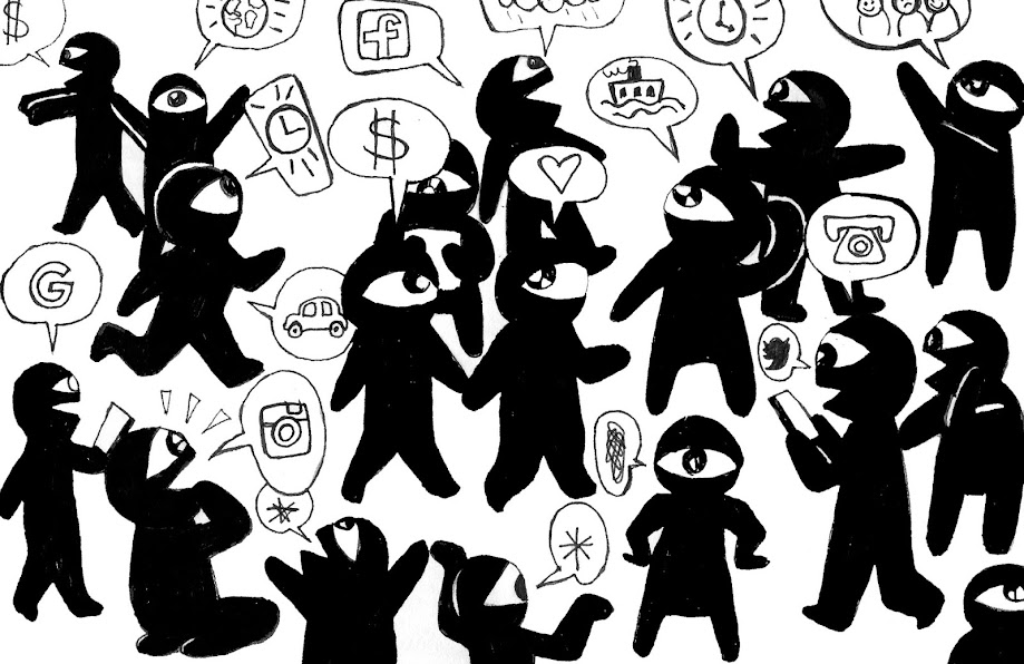
I created this graphic about typography in general yet based on further exploration in typographic animation I might develop. (Soo C. Holster)
http://www.units.miamioh.edu/codeconference/papers/papers/Soo%20Hostetler-2006%20iDMAa%20Full%20Paper.pdf [Accessed 25 June 2020]
Soo C. Hostetler explains in his paper a list of attributes for exploration in the field of kinetic typography.
• Type & Expression of Ideas
1) Typography
2) Form
3) Expressive Meaning
• Space
1) Structure
2) Frame
• Time
1) Motion
2) Sequence
• Supporting Elements
1) Visual Punctuation
2) Color
3) Music
THESE ATTRIBUTES WILL HELP ME TO UNDERSTAND TYPOGRAPHY IN TERMS OF ITS INTERDISCIPLINARY APPROACHES
I'm planning to explore letterform in correspondence with an emotional state they create working with the text and image from 'BLUE'.
However, before I move into kinetic exploration there are few more fonts I would like to experiment with to create text pages in the book.
First of all, here is the entire text divided into passages and each passage will take up a page (or so).
THE MIND, IS LIKE A DENSE JUNGLE.
NOISY AND UNKNOWN,
YET BEAUTIFUL.
IT'S EASY TO GET LOST.
SOMETIMES...
IMAGINATION,MEMORIES BECOMEDISCONNECTED...THOUGHTS ARE LINKINGAND PASSING THROUGH...UNSTOPPABLE...
MIND WONDERS OFF IN UNEXPLAINED WAYS...IT MURMURS, VIBRATES...TANGLING THOUGHTS UPTIGHT!.
IN A CONVOLUTED MESS ARE HEART AND MIND!
THSI! TSHI! THE MONKEY SCREAMS!
WHAT ARE THE COLOURS OF YOUR DREAMS?BLUE AND INDIGO-GREENS...
HEE! HEE! THE RESTLESS MIND
SCREECHES - SCREECH!
- D R E A M -
IS IT NIGHT?
IS IT DAY?
CAN SILENCE TAKE YOU AWAY?...
...TO THE TRACKLESS WASTE...
...TO THE EXPANSE...
...TO THE EMPTINESS OF SPACE...
MIND DRIFTS AWAY...
CREEPING INTO A QUIET,
PEACEFUL
REST...
First proposition for text passage example done in a simple handwritten style with full-bleed on the images. I'm not convinced about the style of lettering, but I think the images work rather well together as an opening to the story.

Another idea is to create a few fold-out pages to emphasise the journey through the mind -
jungle-like landscape, a place of unknown mystery. The image below would be the beginning of the story, a moment when the book is open to surprise and entice the reader.
A Hand-written Bodoni typeface was layered onto the image with reduced opacity.
The same example but with a different typeface - Arial Regular
Before anyone says that Ariel is just a cheap version of Helvetica, I will remind myself, that is just an exercise and it will change and develop with time. Somehow I appreciate this type. But let's move forward.
MODERNISM
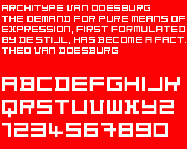
TYPOGRAPHIC EXAMPLES OF GEOMETRIC PRINCIPLES OF De Stijl PAINTING
Theo van Doesburg 1919 TYPE
(https://www.pinterest.fr/pin/338684834450293563/?nic_v2=1a7FCwsaR)
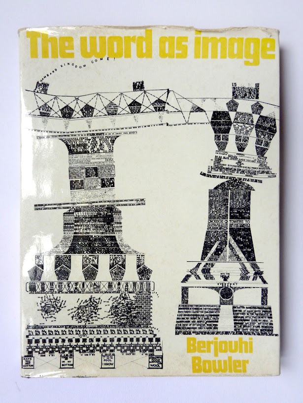
A labyrinth of letters structurally 'defamiliarizing' the writing.
(E. Lupton, A. Miller 'Writing on Graphic Design', p.58)
This typeface is suited to a sci-fi setting in 'BLUE' much more than Bodoni.
Its digital revival was produced by Freda Sack and David Quay of The Foundry in 1997.
ARCHITYPE VAN DOESBURG 1997
Each letter was created on a 5 x 5 grid.
(http://cliparts.co/fotos-van-de-alvabet [12.10.20])
(https://cdnimg.fonts.net/CatalogImages/23/1288700.png [12.10.20])
Fundamentally, books just deal with words. They store letters, pictures and other characters by assigning a page for each.
What is the function of a book?
What is the function of my book?
It's not just storage.
It's a correspondence between type & image to evoke an emotional response.
Every picture book evokes some kind of emotional response.
But I would like my book to be contemplated in search of deeper personal meaning.
Something that you can't easily forget.
Something that makes you ponder...
...stop for a while...
I DREW ON VAN DOESBURG and left pixelated edges.
I copied and digitalised its form on Photoshop.
This type feels primal and primitive. Pixelated and sharpened edges reflect irregular handwork carved in stone with a simple tool.
I'm going to explore it by building an image and text simultaneously from its form.


Comments